- 2022 Pioneer Prize
- From Commercial space
China Merchants Bank 3.0 Plus
Projet Description
Open and integration, step into the future -- CMB flagship branches.
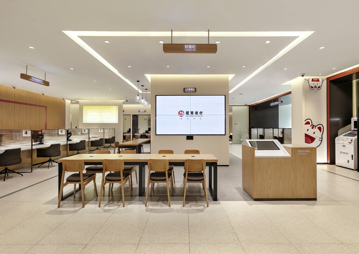
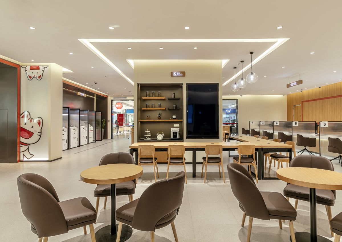
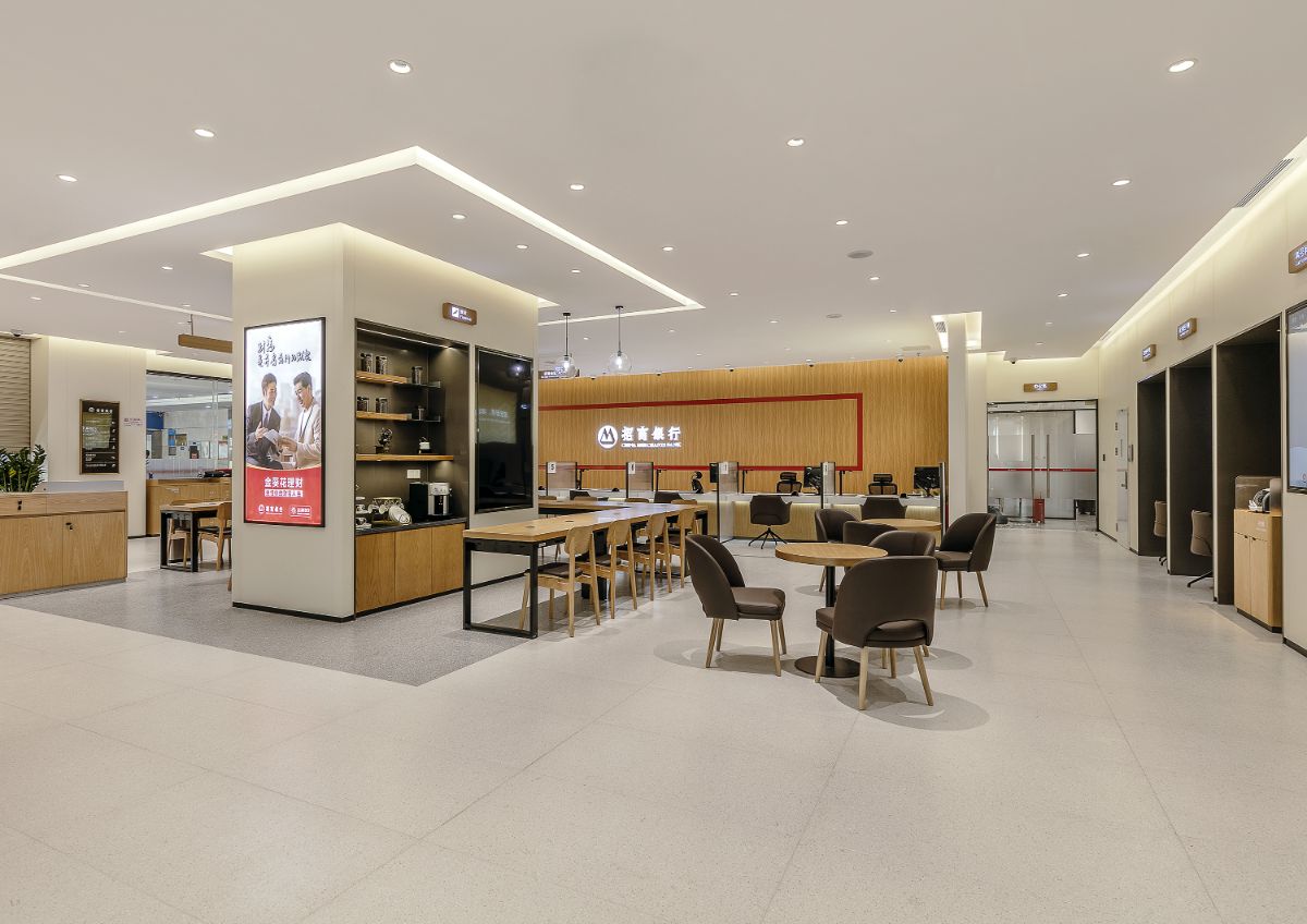
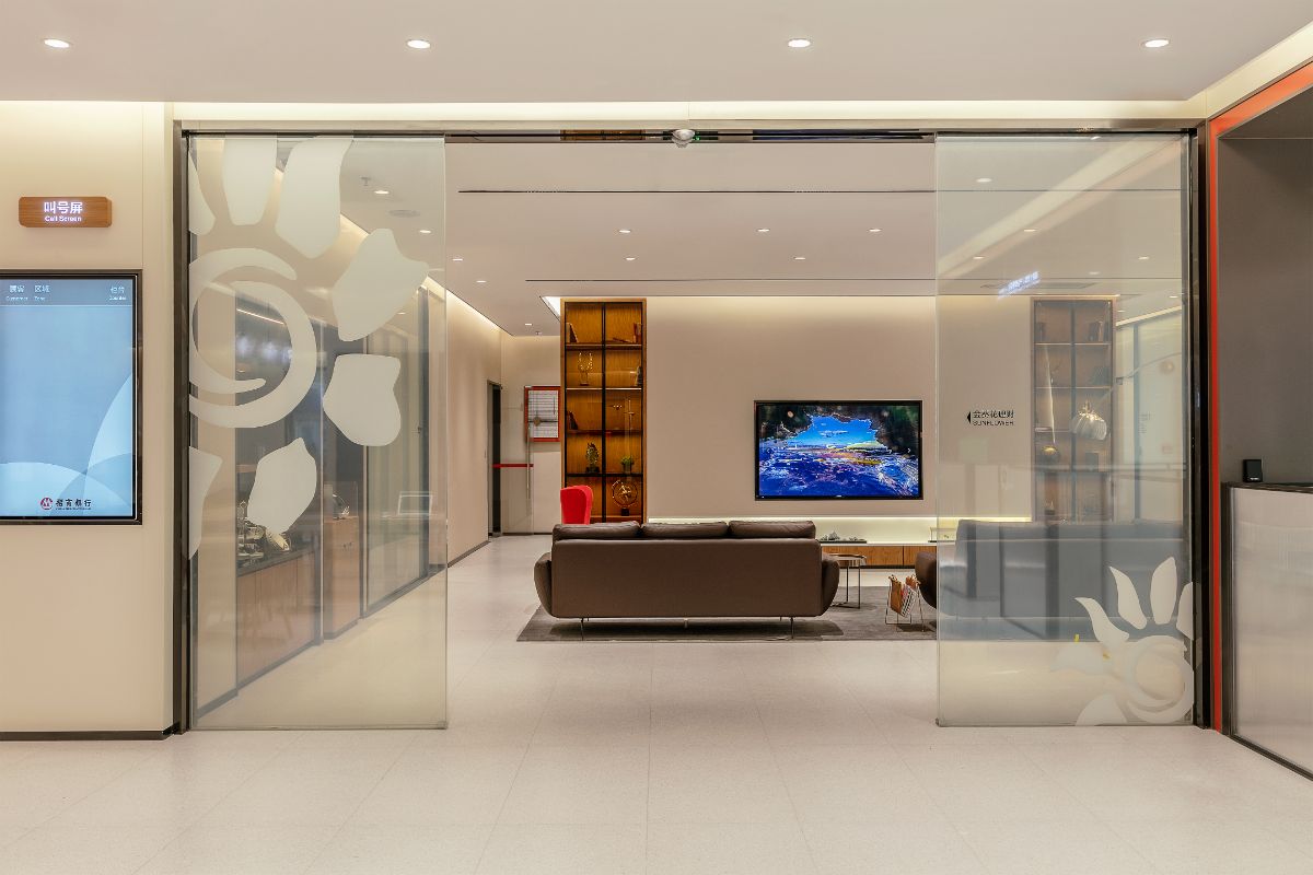
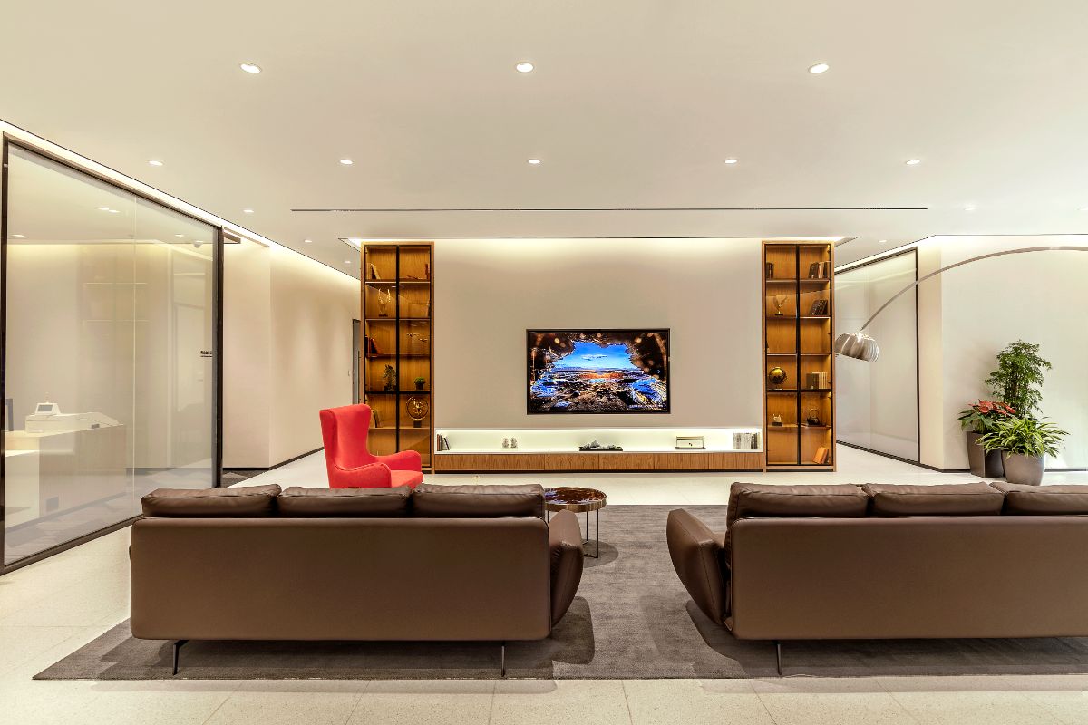
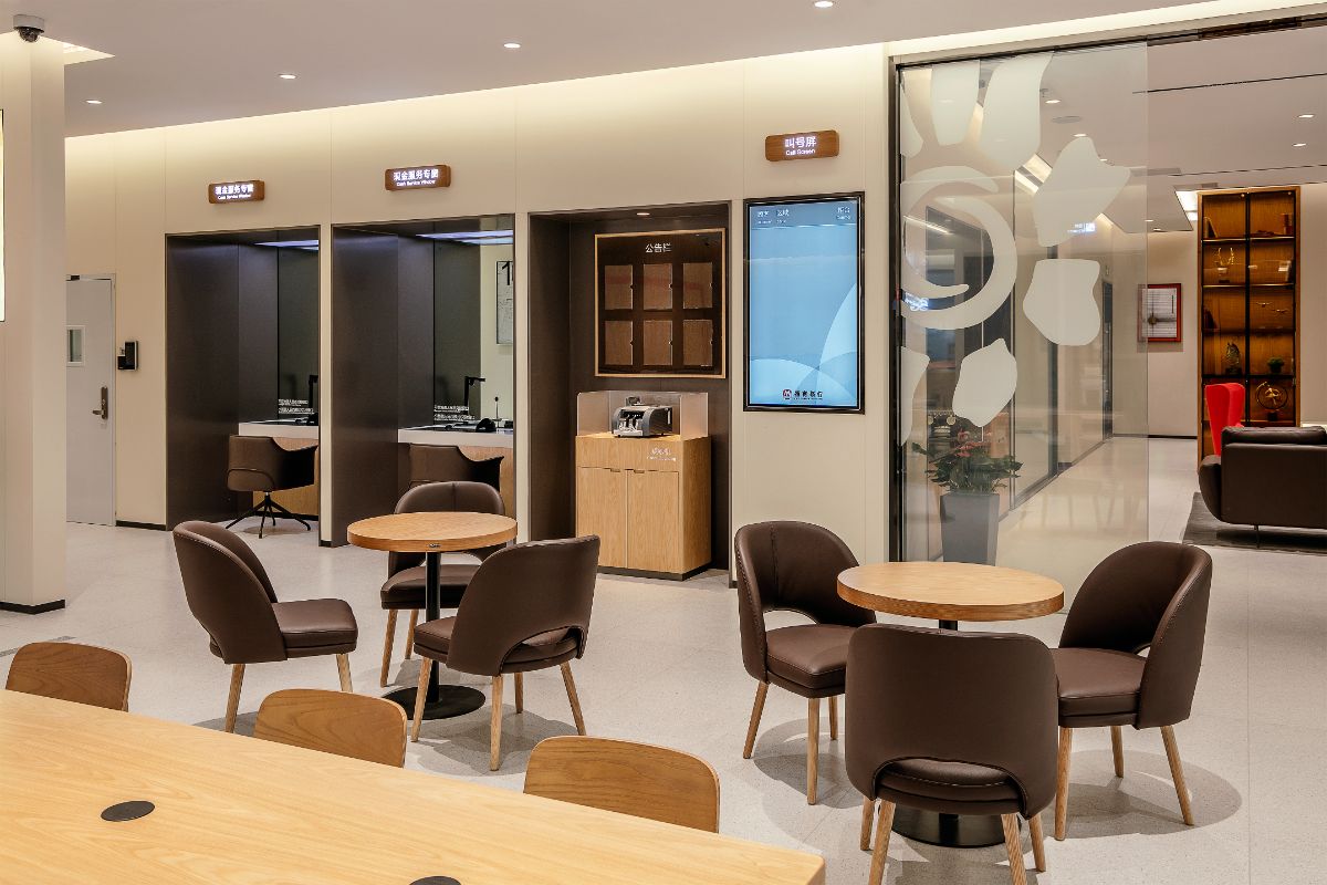
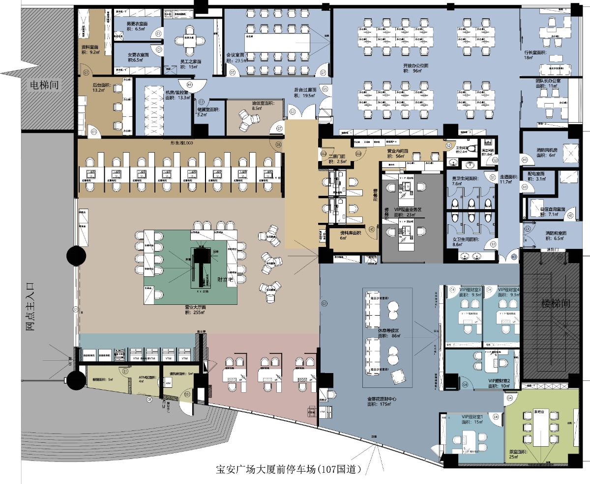
The traditional Chinese meaning of "square" is window, symbolizing safety and stability, which is a shape that is easy to gain people's trust. The square is used as the "core" of the space, and abstract symbol be visualized as the fusion lounge area been placed in the lobby, showing the first impression of China Merchants Bank's trustworthiness for customers. At the same time, the area carries the one-stop function of guidance, rest and service, which conveys an open and friendly message to customers, and is more conducive to customers to establish links here.
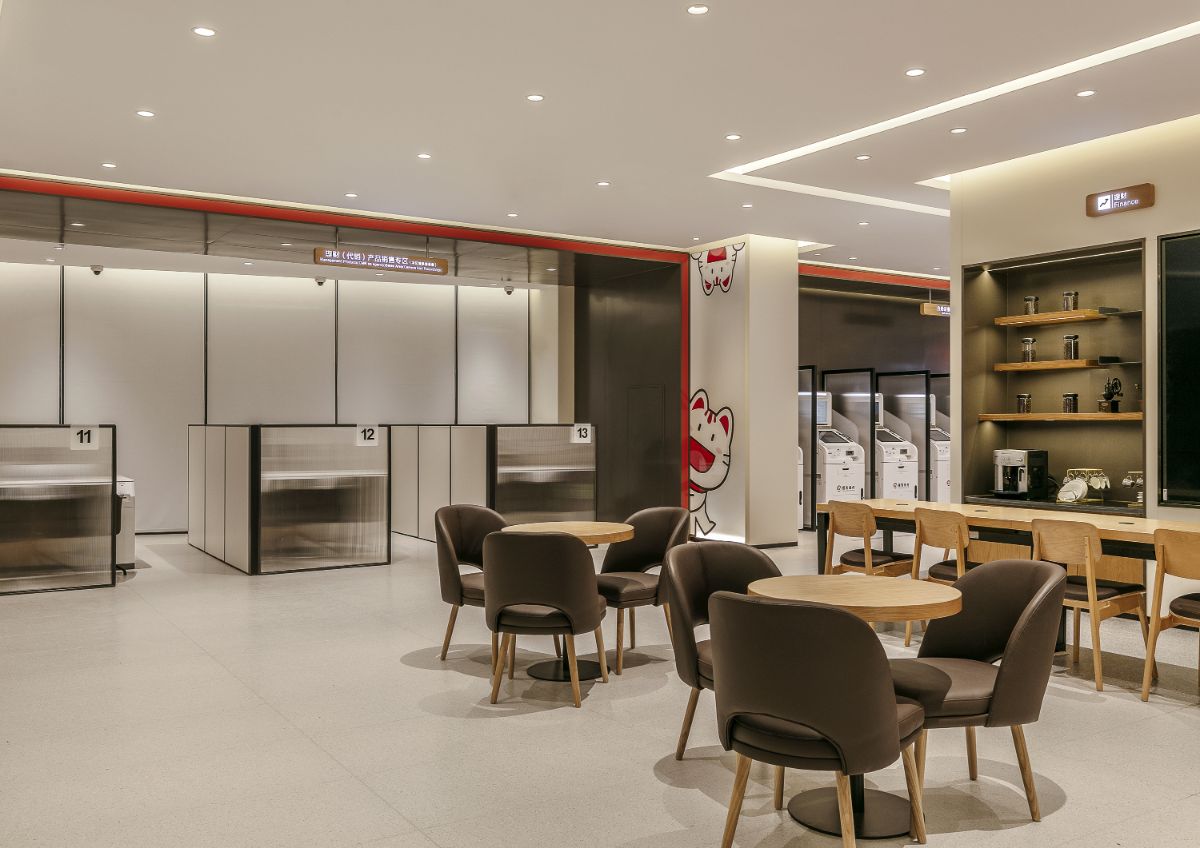
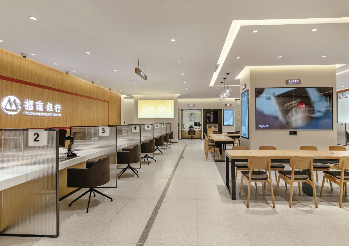
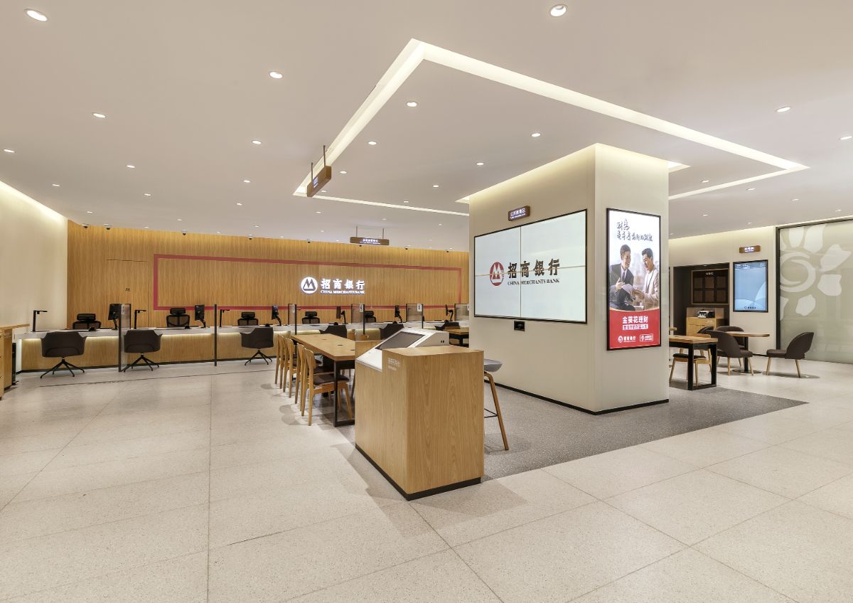
The entire space divides the spatial level through the characteristics of each area, creating the multi-functionality of the core area, so that the bank is not only for business handling, but also for social networking. In the use of space materials and colors, the main selection of wood grain, leather, glass and black border plus brand color embellishment, with soft and warm lighting to set off the atmosphere: wood grain tonality and texture, and 5500K color temperature of the light echo, aimed at creating a communication, connection, modern, comfortable space style, so that people in it to enjoy relaxed, pleasant, brisk communication, it also reflect the design theme of the space: technology and humanities - future bank, that is, focusing on science and technology, but also pay more attention to service experience, It invisibly pulls in the distance between customers and the environment, highlighting the service attributes and advantages of China Merchants Bank.
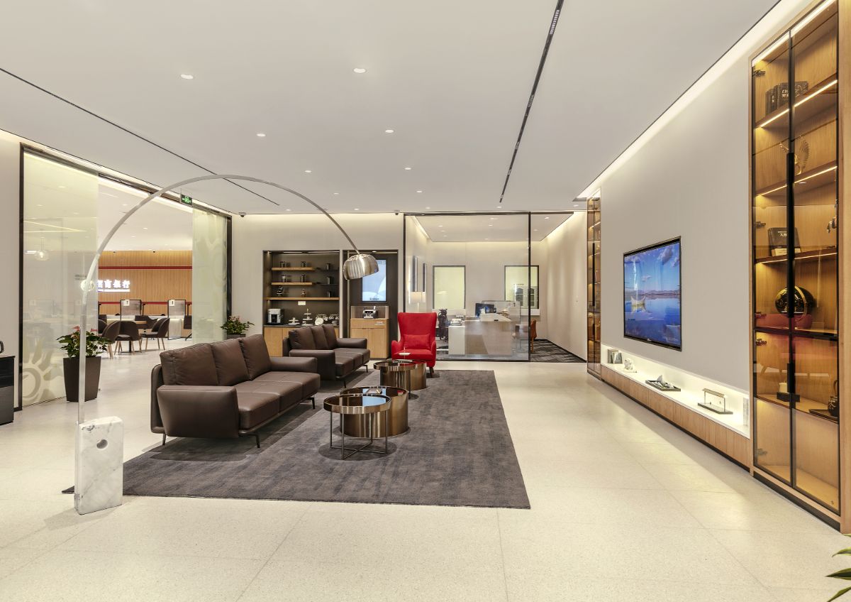
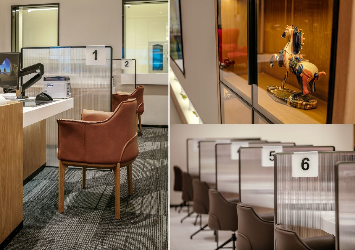
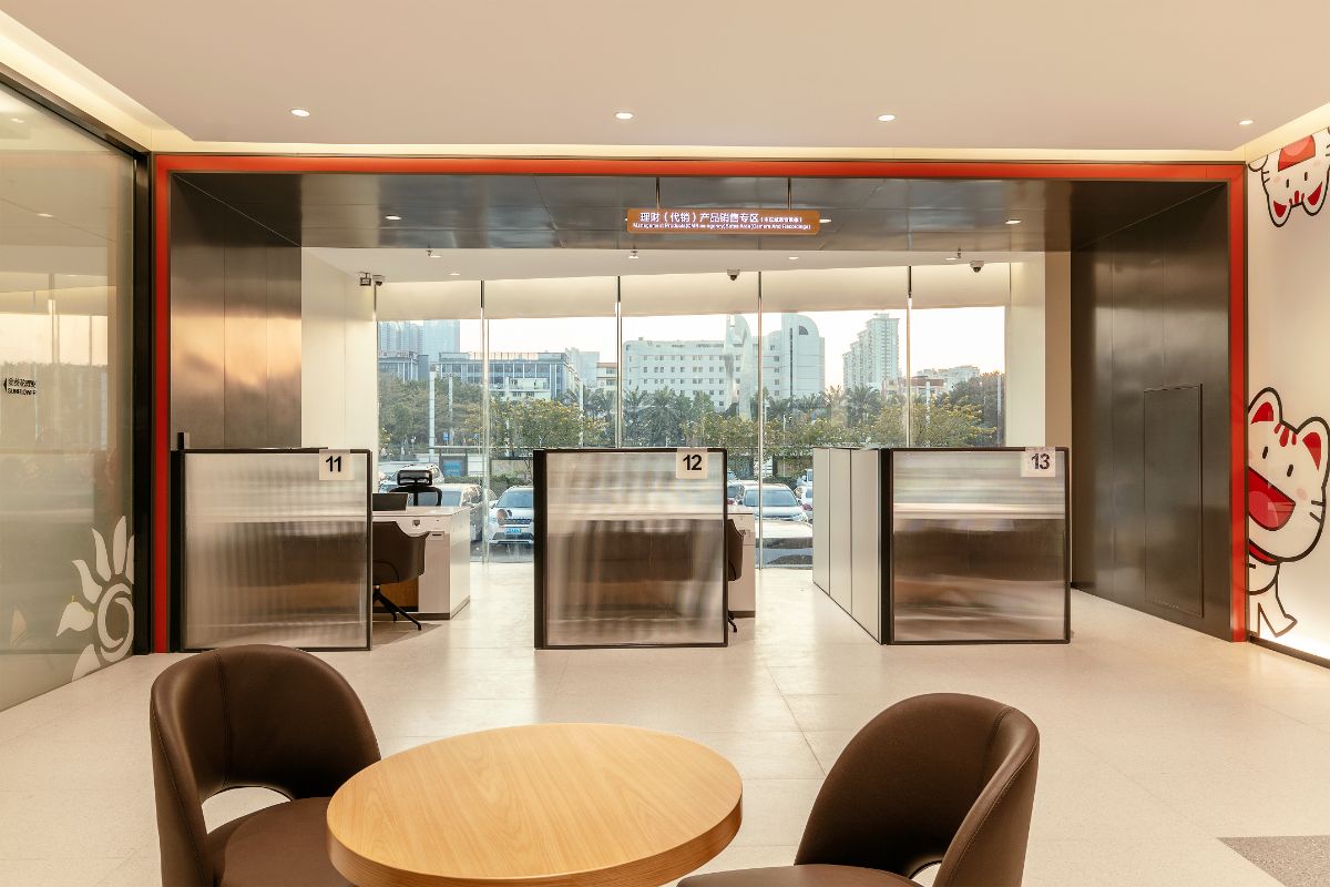
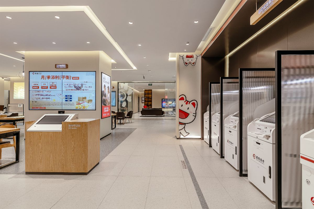
The integrated rest area around the central area combines functions such as form filling, negotiating, waiting, and resting, changing the serious and dull image of the lobby in the past, and adding a lot of leisure atmosphere to the central area. The self-service area and the non-cash service area are arranged in an orderly manner on the left and right sides, and the visual is transparent and clean, and the atmosphere is smooth and majestic. The golden sunflower VIP area locates at the back of the space, it is as if welcoming a distinguished friend with an open arm towards the entrance. The design of the flagship branch of China Merchants Bank 3.0 Plus is a leap in the image of the banking industry, which opens up a new user experience of "Technology + Life + Finance" of China Merchants Bank.
CM Design is the first domestic brand SI and experience POSM design company. Guiding by positioning theory and aiming at "Aesthetic design and Scene creation", CM design subverts the traditional SI design concept and mode, and creates a new age of "scene aesthetic design" and "branding experiential marketing".
CM Design is based on the trend of taking consumers as the core in the new-retail generation, taking strategy as the guide, design as the means, scene as the carrier, experience as the core to reconstruct the new logic and new battle method of people, goods and field, and create the main off-line battle field of the brand.