- 2022 Pioneer Prize
- From Package Design
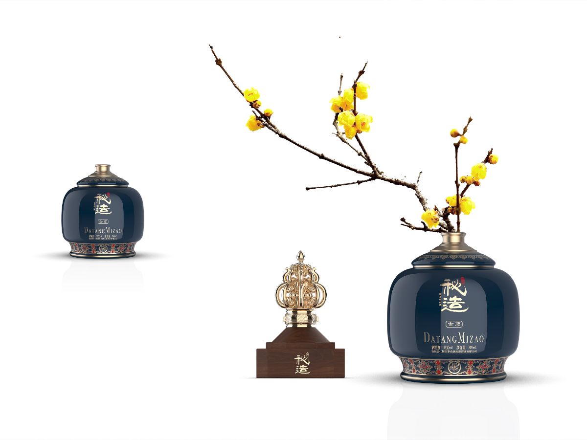
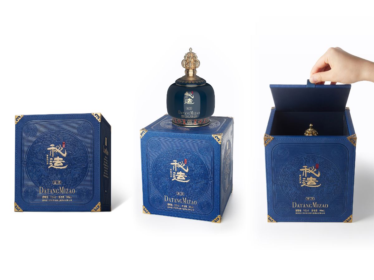
Tang Dynasty M I Z A O Golden Top
Projet Description
As an important cultural heritage of China and a relevant part of the culture of the Tang Dynasty, the liquor culture has been enriched and sublimated over a long period and is of great significance to the inheritance and development of traditional Chinese culture. With the promotion of Chinese Tang culture as its starting point, the product adopts a minimalist design strategy to subliminally convey the culture originating from the Tang dynasty to consumers through the visual elements on the packaging, thus conveying the profound traditional culture of the Tang dynasty, which transcends thousands of years.
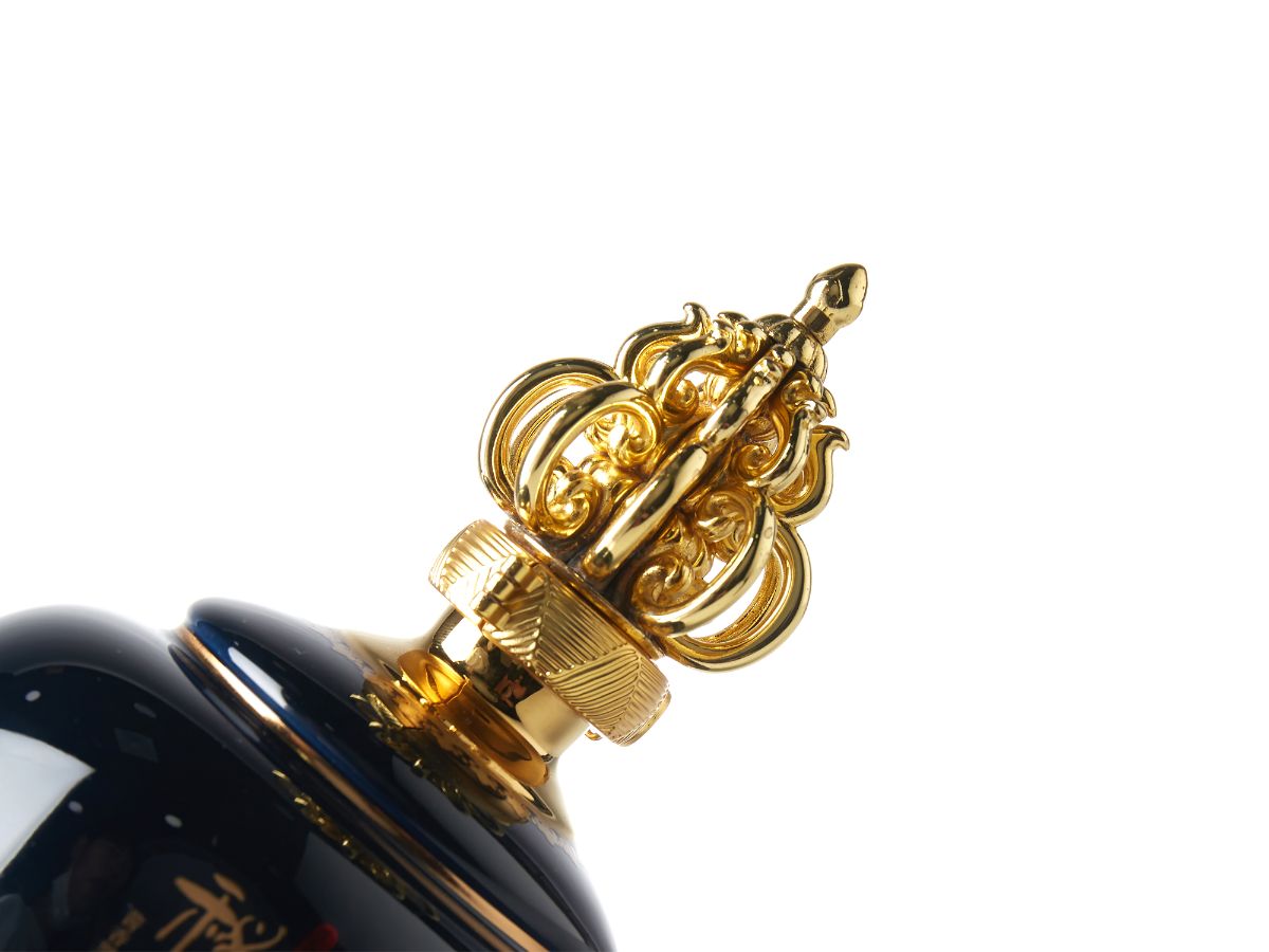
Inspired by the blue glaze of the Tang Tri-colour ceramics, the product employs the color scheme with the royal blue color as the main color that was common in Tang dynasty royal family.The major part of the product is royal blue, which gives the bottle a pure, warm, and noble appearance. Its cap is derived from the golden top of a Tang Dynasty palace, making it stand out among other products and also echoing its name, golden top. The hollow-out golden cap visualizes the grandness of the Tang Dynasty palaces with golden top, or golden dome signifying the highest and the best, echoing the consumers’ spiritual aspirations of high-end liquor, as well as the brand's aspiration to lead the industry and showcase Chinese culture to the world.
As for the bottle design, it follows the shape of a liquor jar in the Tang Dynasty, and utilizes the traditional Chinese ceramics process. It also incorporates the architectural culture and liquor culture of the Tang Dynasty. Through its design, the inheritance and interpretation of Chinese culture get highlighted. Its inward contracting bottom is decorated with the palace decorative patterns of the Tang Dynasty and the four sacred beasts of China, symbolizing peace and auspice.
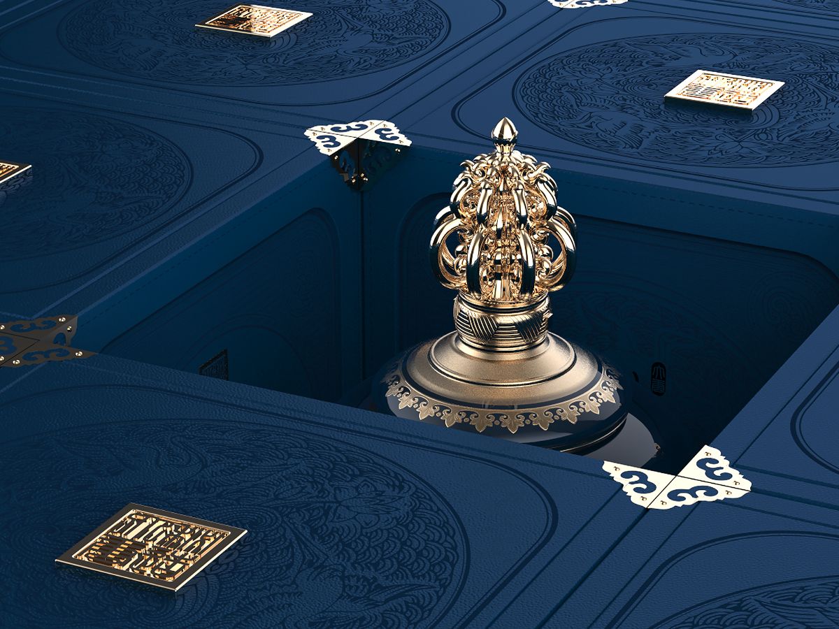
In addition, its outer packaging features imitated Tang Dynasty calligraphy, complemented by the Zen picture of cranes in the lotus, conveying both Zen philosophy and royalty spirit as well as a symbol of auspiciousness and virtuousness.The four corners of the packaging are covered with golden protective pieces to ensure that the packaging is less susceptible to deformation and balances the overall color layout, enabling the product to be more visually layered and aesthetically pleasing.
Fenggu Muchuang,a creative planning company integrating the service of both “brand strategy” and “packaging research”, is dedicated to forging a “domestic cultural brand” and building a “local city card”. We are committed to seeking brands’ cultural value for enterprises and creating product drivers, thus contributing to larger market penetration of products for enterprises.
Ever since our inception in 2014, we have served more than one hundred fast moving consumer goods companies including tobacco, liquor, red wine, tea, food and beverages, among which there are listed companies and nationally renowned brands, as well as many local SMEs and regional specialties. In this connection, We are highly acclaimed for our expertise and fervor and we’ve also won multiple design awards at home and abroad along the way.
Our company endeavors to discover and characterize cultural origins, therefore, to enhance our brand value. In this regard, we aim to create more domestic brands, making charm with Chinese characteristics woven into the cultural fabric by cultural recognition and visual techniques.