- 2023 Silver Prize
- From Commercial space
LILA
Project Description
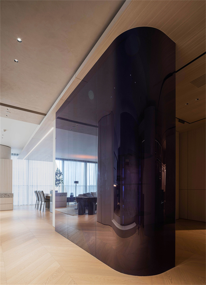
LILA; In German for purple, a color of 50% blue and 50% red; A color of sensuality, power, and rigor. In my consciousness, purple also has an artistic nature, which we experience in life and pursue in creation. Therefore, in this case, I hope to intersperse purple in the space as the theme.
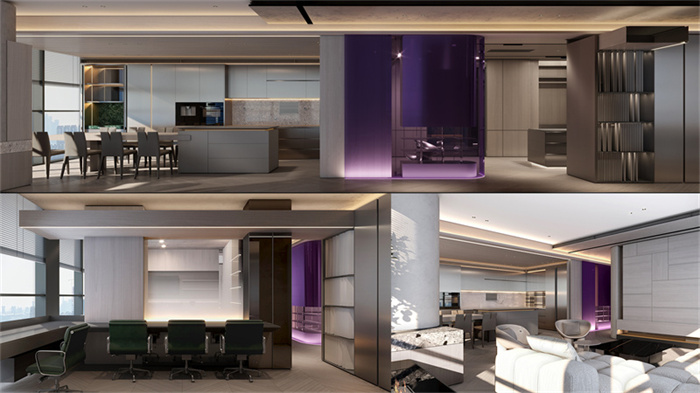
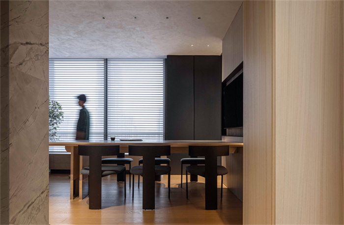
The design of the project refers to modern architecture.The plan layout is based on the long axis stretching and the logic of short axis partition to create migratory and visiting moving lines. Due to the experience of perimeter space, the project will not be boring at a glance, and visiting customers will unconsciously wander the moving line of the project due to the follow-up clues and hierarchical relationship of spatial vision.
Eentrance and Flow line
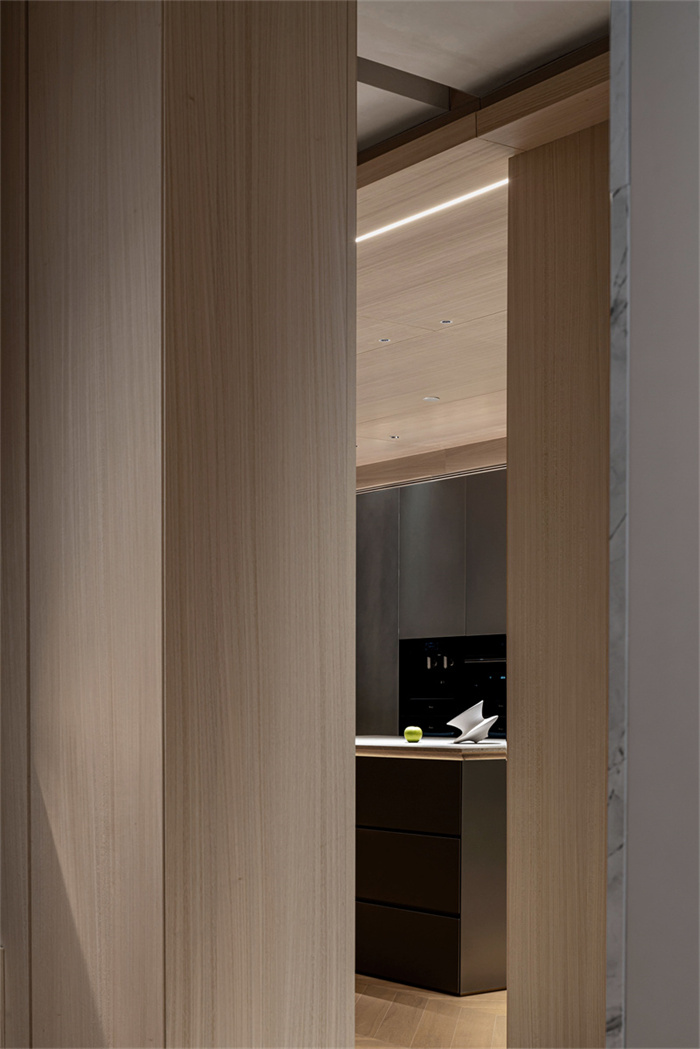
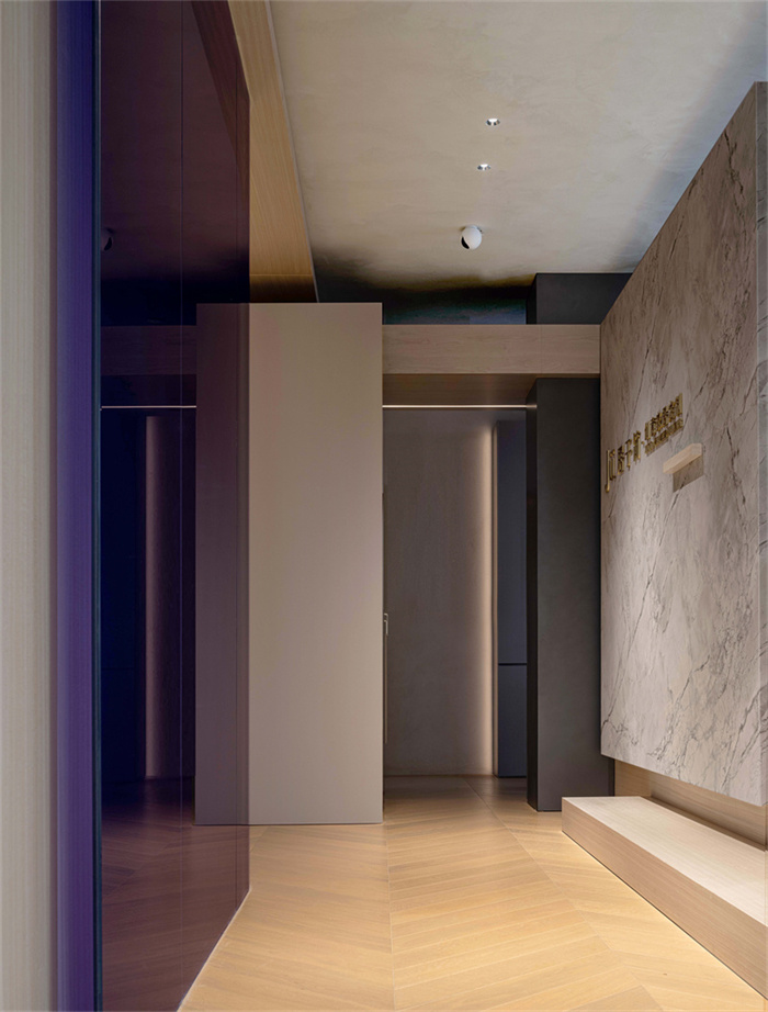
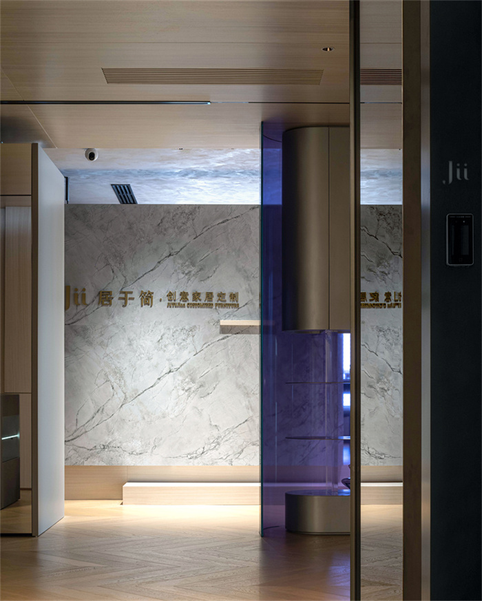
The space entrance appears in subtraction at the corner of the plane and is arranged perpendicular to the long side. Intuitive manufacturing of two entry lines: one vertical cutting in, the other from the short side can stay and observe.
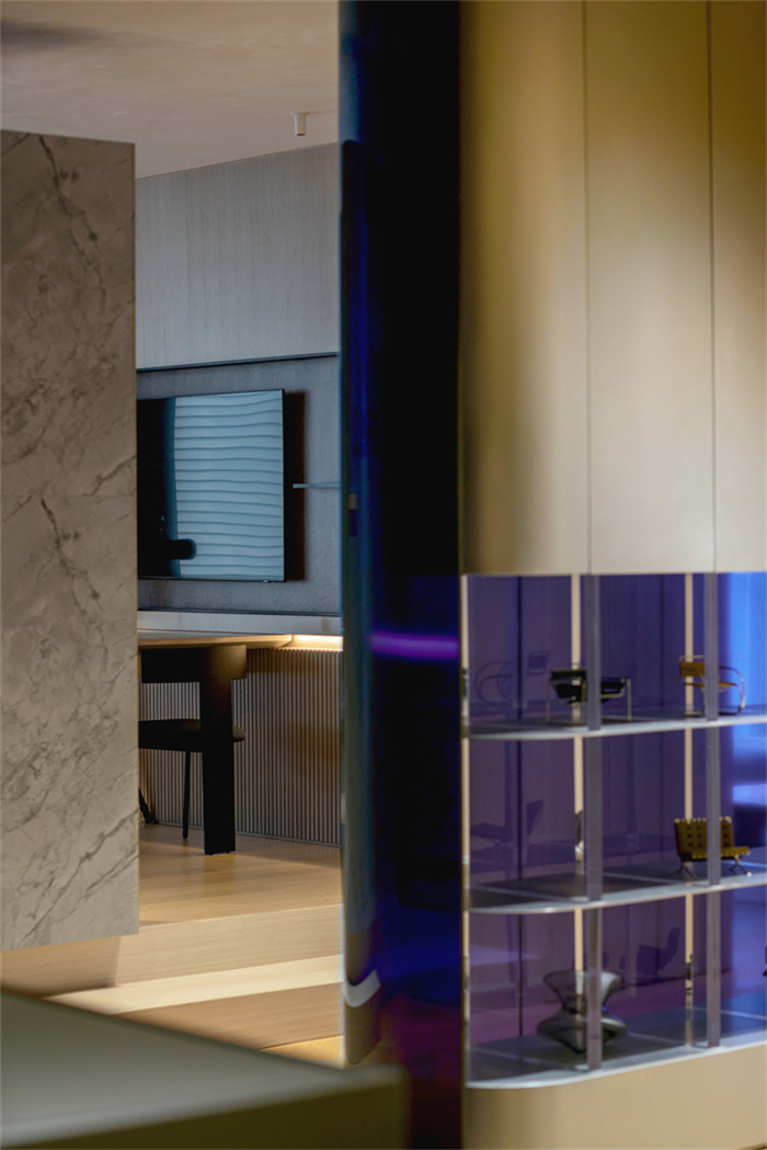
The space design retains the technique to maximize the vision -- visual emphasis is arranged diagonally in the plane layout: dislocation structure and glass can be connected by visual interaction between space and space. Hard installation modeling uses asymmetry, extension between structures, stacking, balance and other techniques in the stretch of the field to create a sense of space rhythm in a simple form + simple modeling.
Proportion
In the project plan, some recurring basic shapes with integer proportions can be found from the area division. Examples include the golden ratio rectangle, the 1:2 rectangle, and the 1:3 rectangle.The combination of diagonal space and perimeter space separates visual and tactile experience (separation of sight line and moving line), and generally increases the interest of perceptual space.
Light
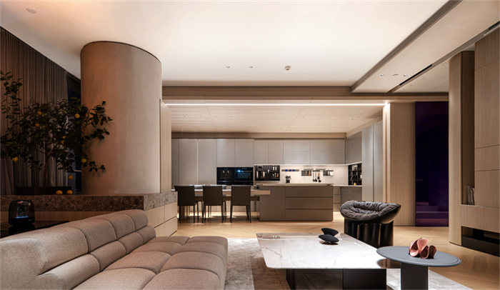
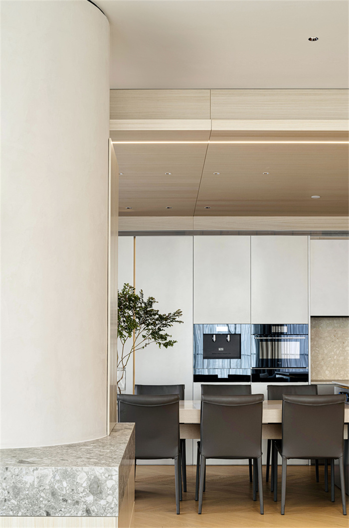
The project’s located on the 25th floor, facing the Pearl River and overlooking Guangzhou Tower. Naturally, there is abundant natural light. The lighting of the project faces the northwest and the sunshine is strong. Based on the relationship between landscape and light and shadow, the design of the project is almost completely cut off from the top.
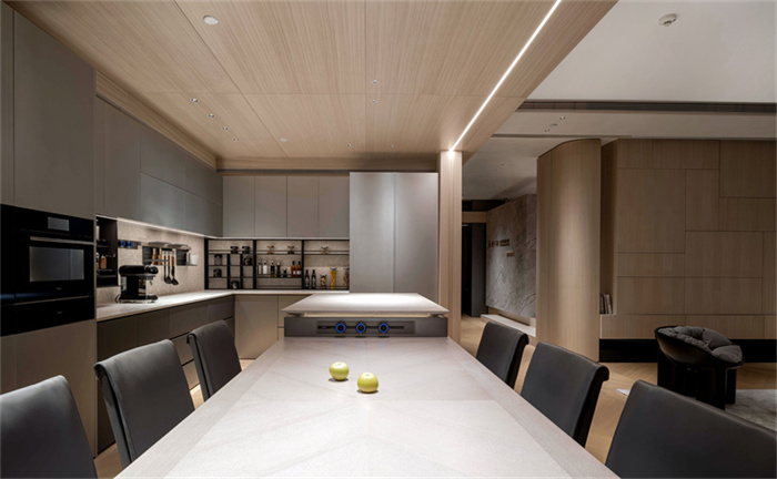
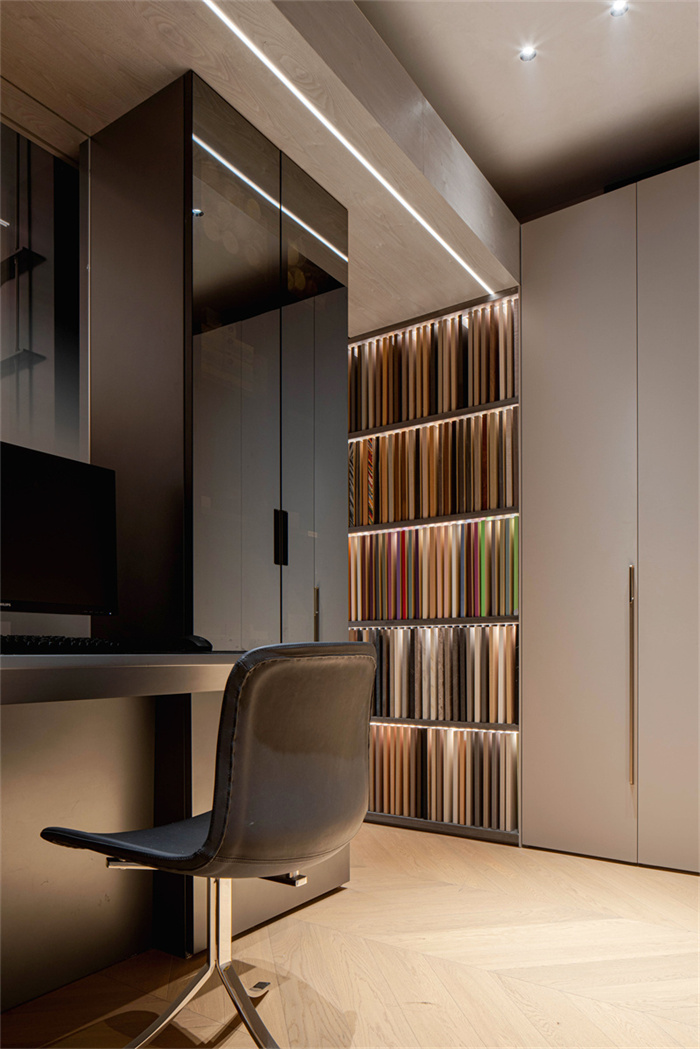
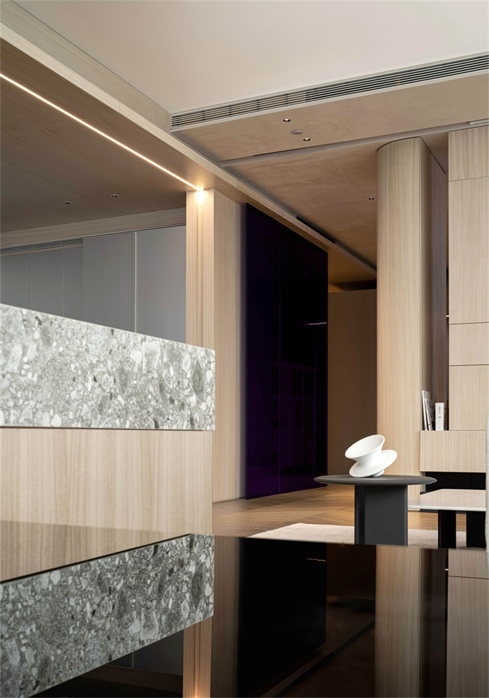
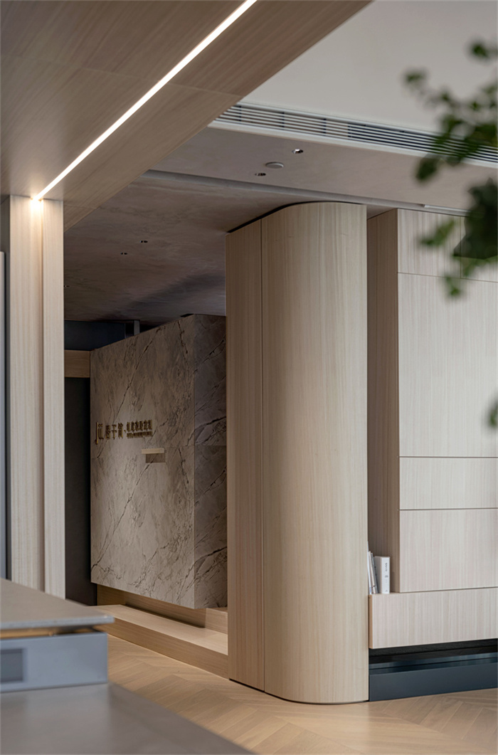
Materials and Theme
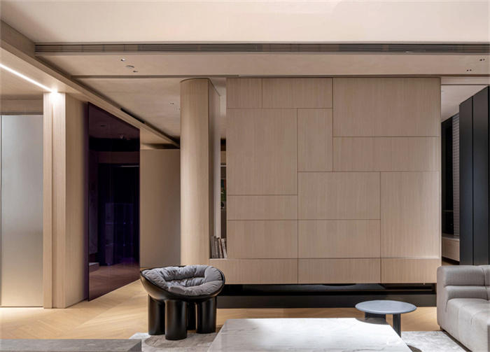
Modeling a large number of use of light color natural wood veneer, wood color wood floor, sand color art paint and silver imitation stainless steel paint version, the space is based on the earth color overall light and comfortable; Considering that the entrance is in the backlight position of the plane layout, the visual focus of the vestibule chooses a transparent purple curved glass as the color focus of the space, to emphasize the theme color through the strong saturation contrast of the color, more hope that the combination of glass characteristics can let people along with the visual Angle and shadow changes of the movement of the visual device has space penetration, mirroring and reflection of the visual extension.
Pace is a constant value, constantly changing is the people, objects, scenery.
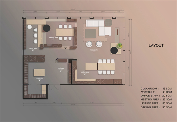
Poject Information:
LOCATION:CHINA GUANGZHOU
ACREAGE:200 SQM
TYPE:SHOWROOM DESIGN
INTERIOR DESIGN:NON DESIGN
DESIGNER:BRANDON LAU
ASSIST IN DESIGN :JYJ
graduated from Guangzhou Aacademy of Fine Arts
10years industry related experience
set up a personal studio (NON-DESIGN) in 2021
Current design Director of NON-DESIGN