- 2023 Silver Prize
- From Package Design
EMOSENSE
Project Description
The audience’s feeling is prioritized by the presentation experience
design firm EMOSENSE. EMOSENSE, which mimics the meaning of the
English words emotion and sense, is defined as emotion and sense. In
keeping with the speech’s topic, it tries to fulfill the event’s main objective
by promoting collective action or decision-making with EMOSENSE, an
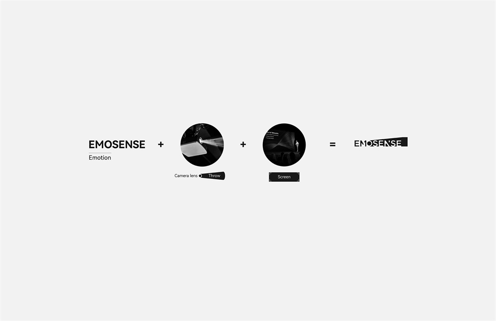
audio-visual design that can evoke the audience’s emotional resonance. Its creative concept is to design sensibility with rationality. The technique
of transferring the spoken scene's lens to the screen is reproduced by
merging the English words “emotion” and “sense”, and the purer
creative thoughts are presented through visual forms, breaking through
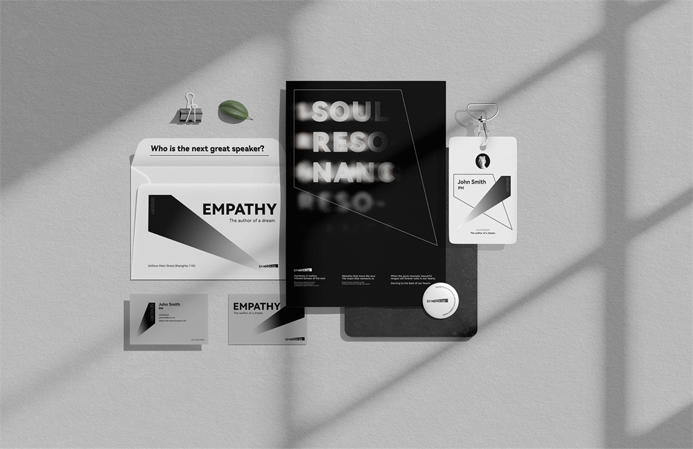
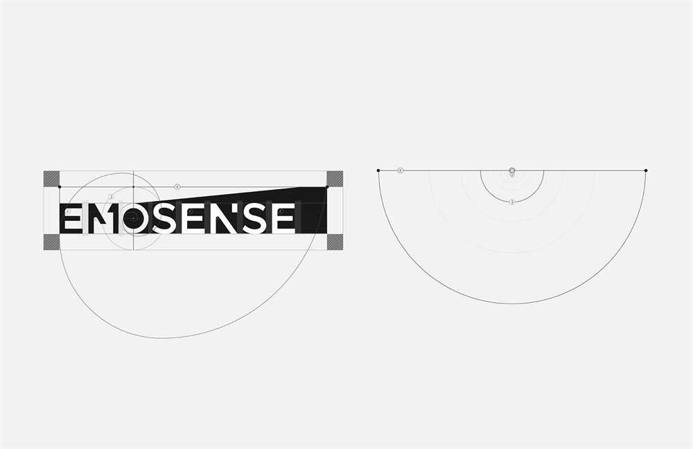
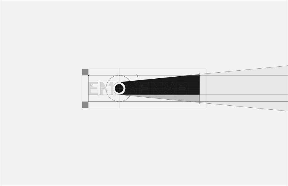
the audience’s habitual visual cues and evoking emotional resonance. A portion of the English letters from the words Emotion and Sense were
taken out for the design, and they were artistically placed to reach the
ideal golden ratio. Ultimately, they formed the shape of the logo.
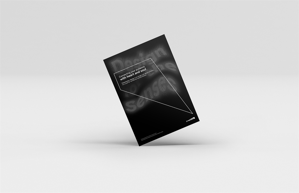
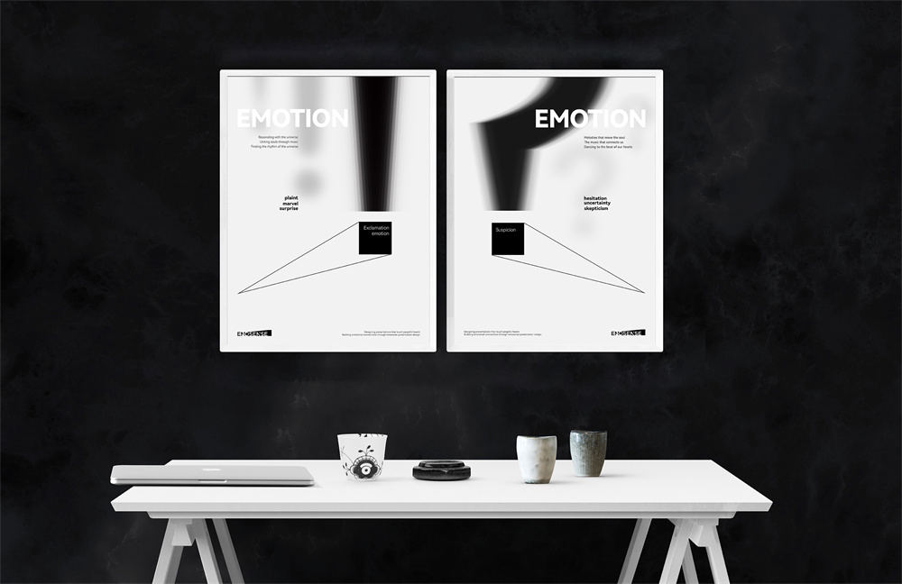
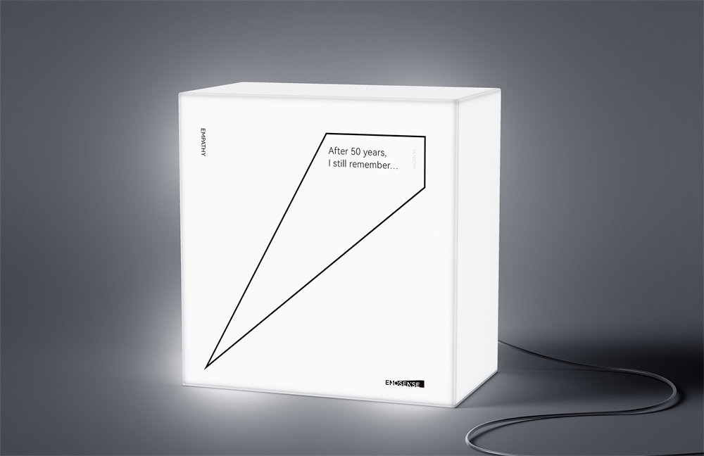
In order to evoke the audience’s emotional resonance and convey the
emotional value of the brand’s inclusiveness and freedom, the auxiliary
graphics employ the lens projection as the design concept and create an
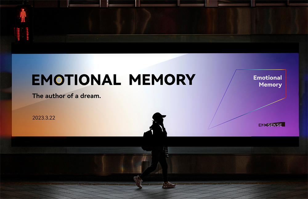
ambiance utilising various gradient colours. For example, the billboard in
the subway station use blue-orange as the background color, projecting
a blue-pink gradient, bringing a blurry but fashionable experience to
consumers; the office space uses black as the background color, projecting a bright orange-blue gradient, allowing employees to work in
a positive and warm, rigorous and serious working state; the speech
scene uses a deep blue-purple gradient, which fully attracts audience’s
attention, as if they were in the vast space.
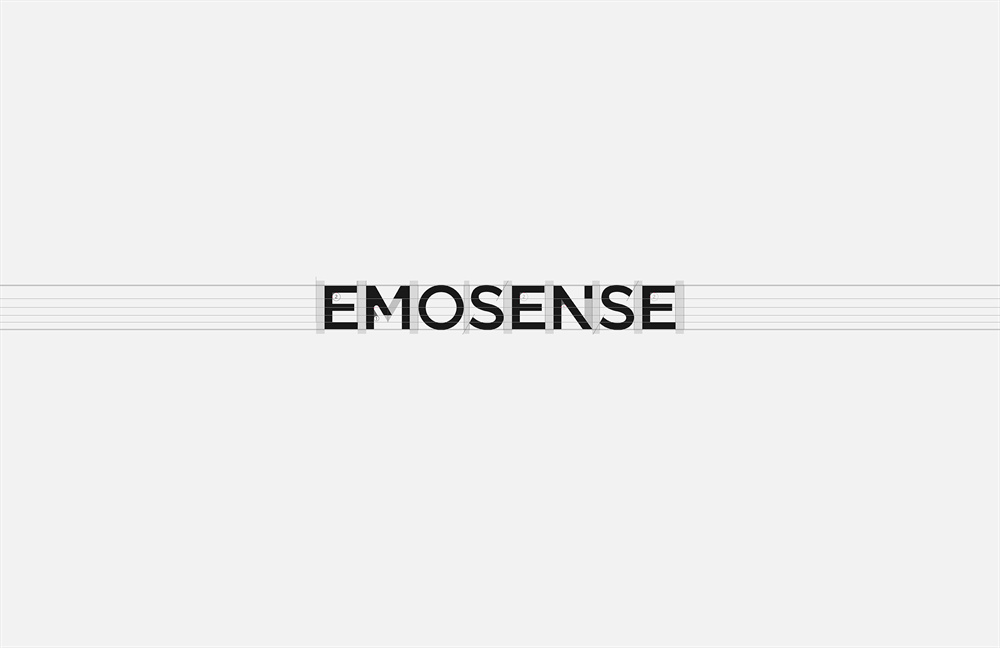
In order to form a unity with the logo’s modeling structure, its English
typeface is the is a modern sans-serif font (by using the breaking and
positive & negative figure techniques, the typeface in the logo is concise, powerful and highly recognizable, reflecting the humanistic, open, soft, and conscious font temperament, bringing a different visual experience).
Shanghai Rapidesign Advertising Co., Ltd. was established in 2007 and is a pioneer in
China’s presentation industry, always focusing on high-end PPT design and training. It
has provided PPT design and training services for Fortune 500 companies such as
Huawei, Alibaba, Tencent, Xiaomi, SAIC, China Chemical Industry, China Aerospace and
various government units for many years, helping more than 9,500 conferences with
wonderful presentations and providing more than 1,000 corporate training sessions. The PPT business radiates at home and abroad. Since 2015, its annual revenue has
exceeded RMB 10 million.
Rapidesign is committed to “making PPT with movie standards”, controlling the entire
project with director thinking. From the initial content construction, planning, to
visualization, animation storyboarding, art design, 3D modeling rendering and special
effects production, every aspect is carefully polished to help customers present a
presentation feast that touches people’s hearts and empowers their marketing events.