- 2024 Silver Prize
- From Catering Space
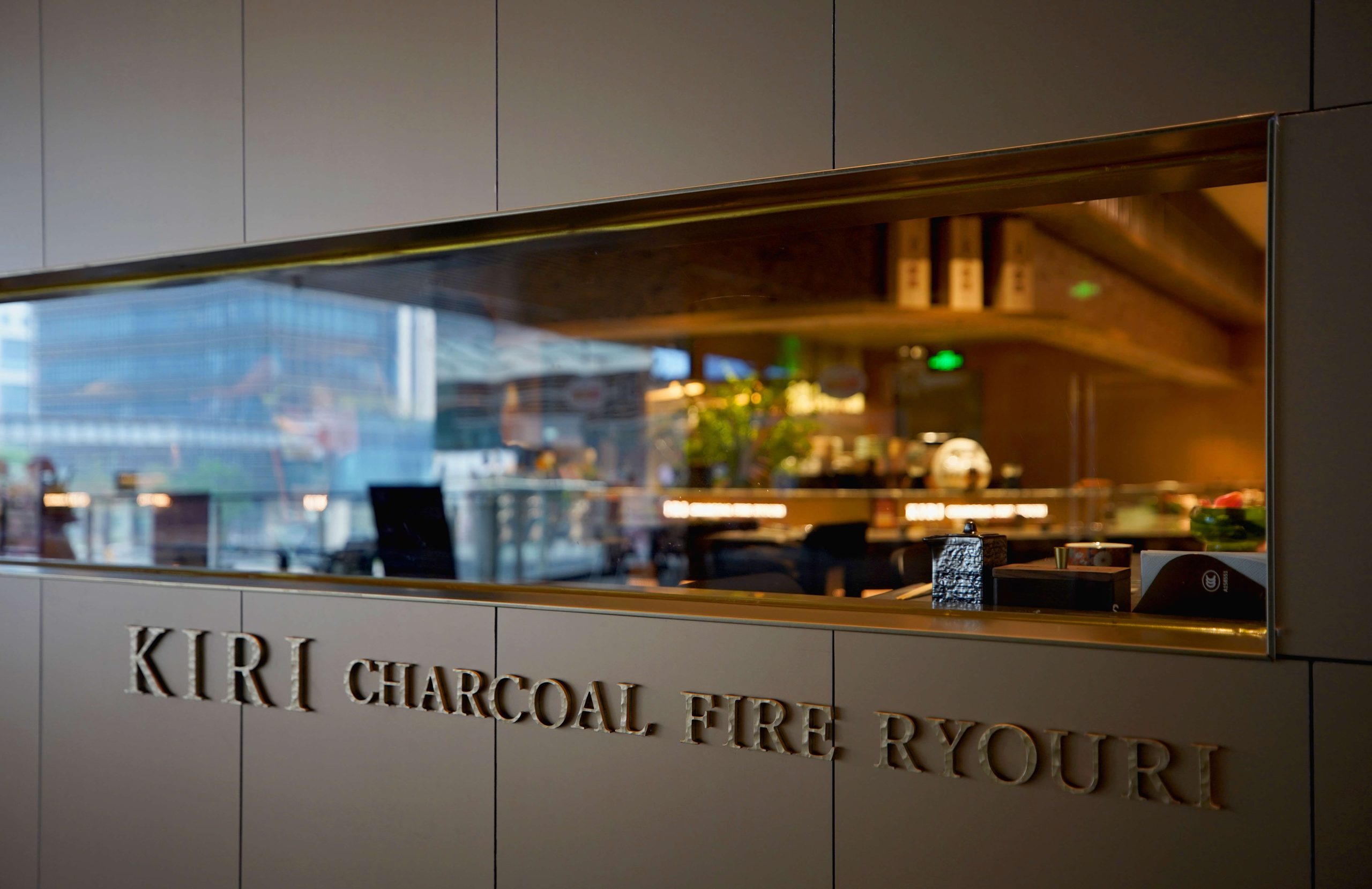
KIRI
Project Description
Kiri, the Japanese word for Tung, is a deciduous tree of the family Scrophulariaceae; the wood is light, the bark gray-white, and the leaves opposite, with purple flowers.
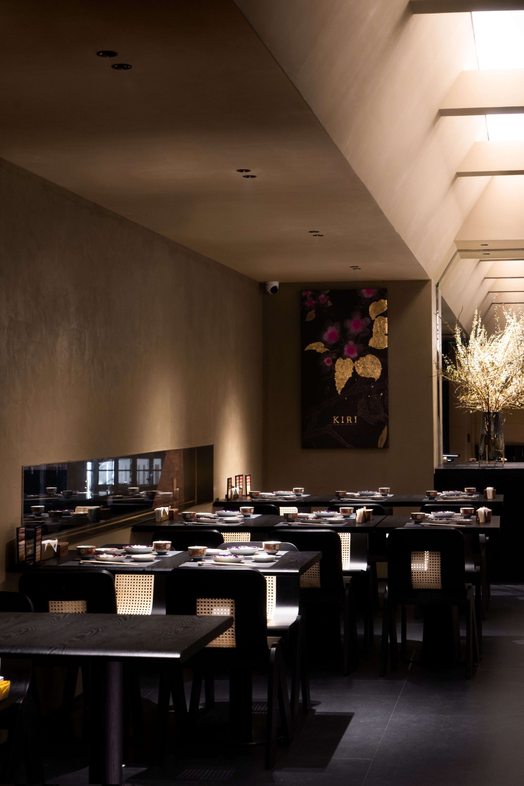
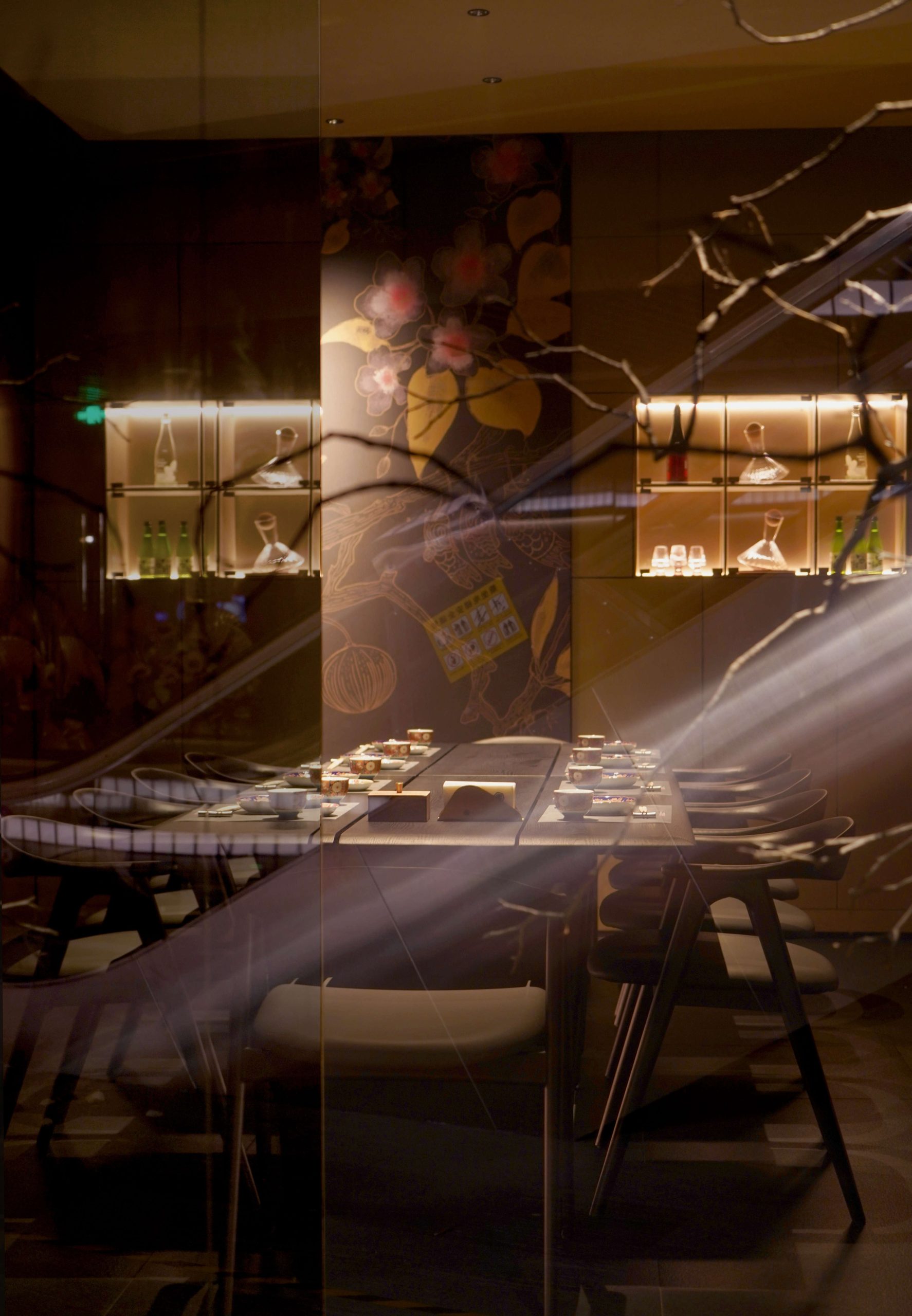
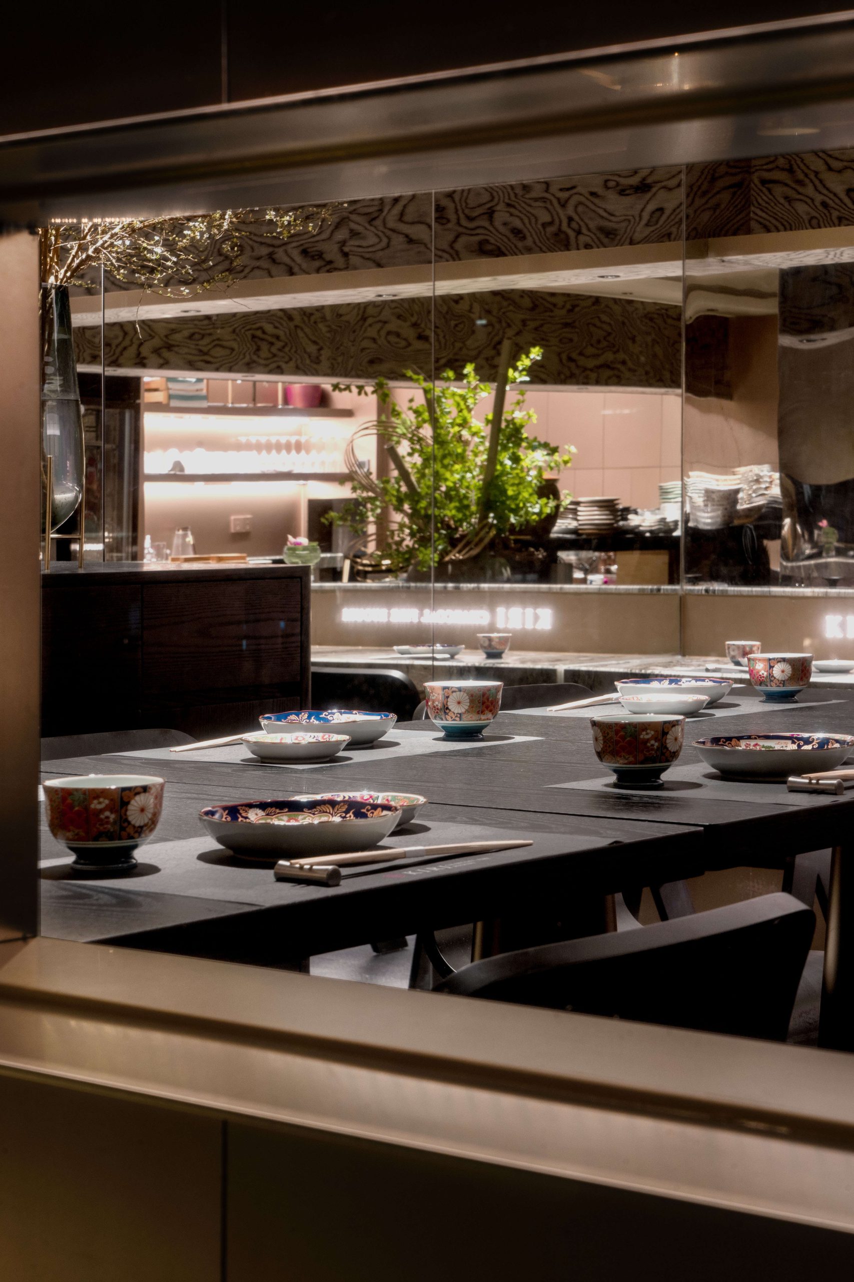
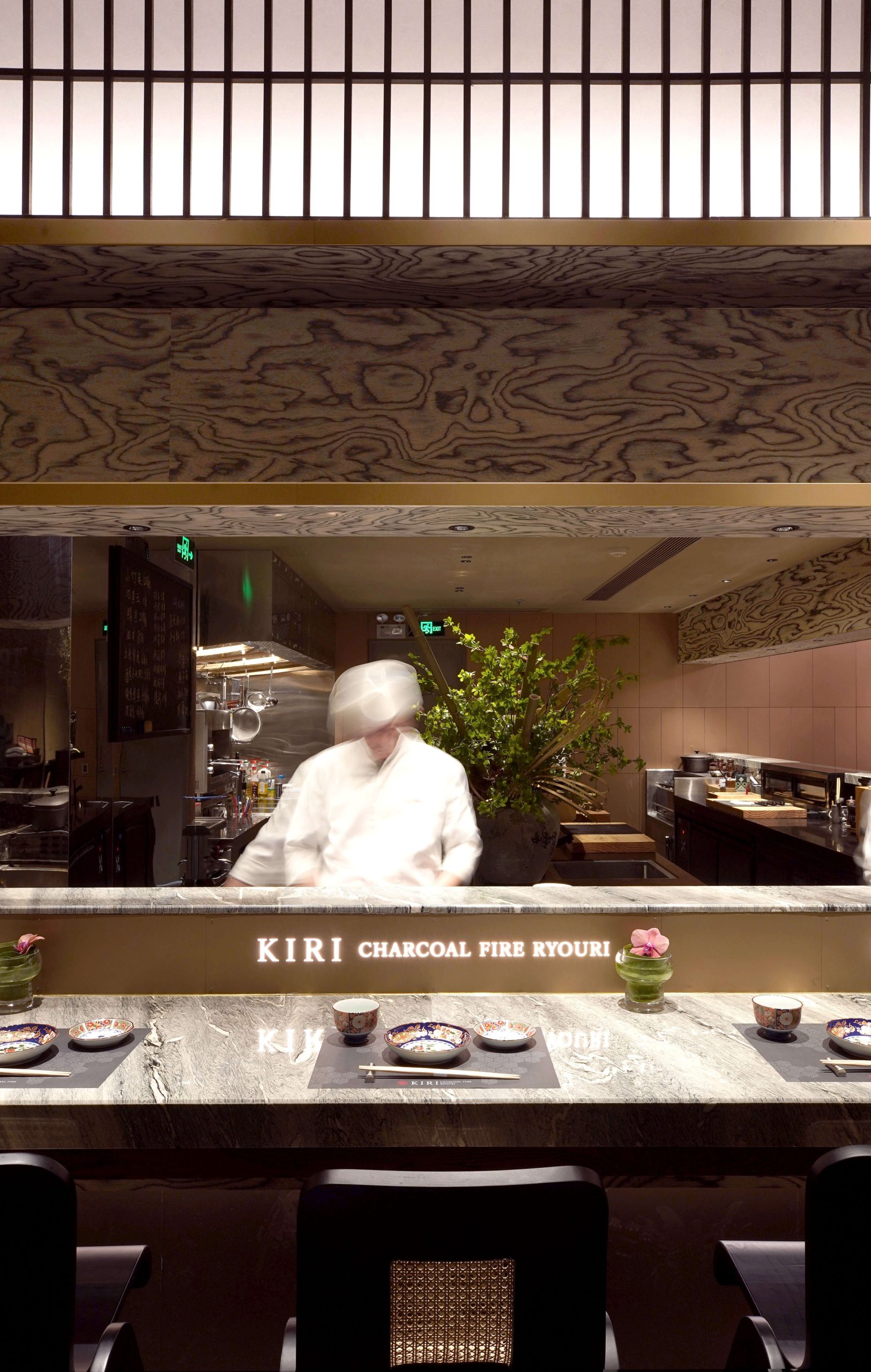
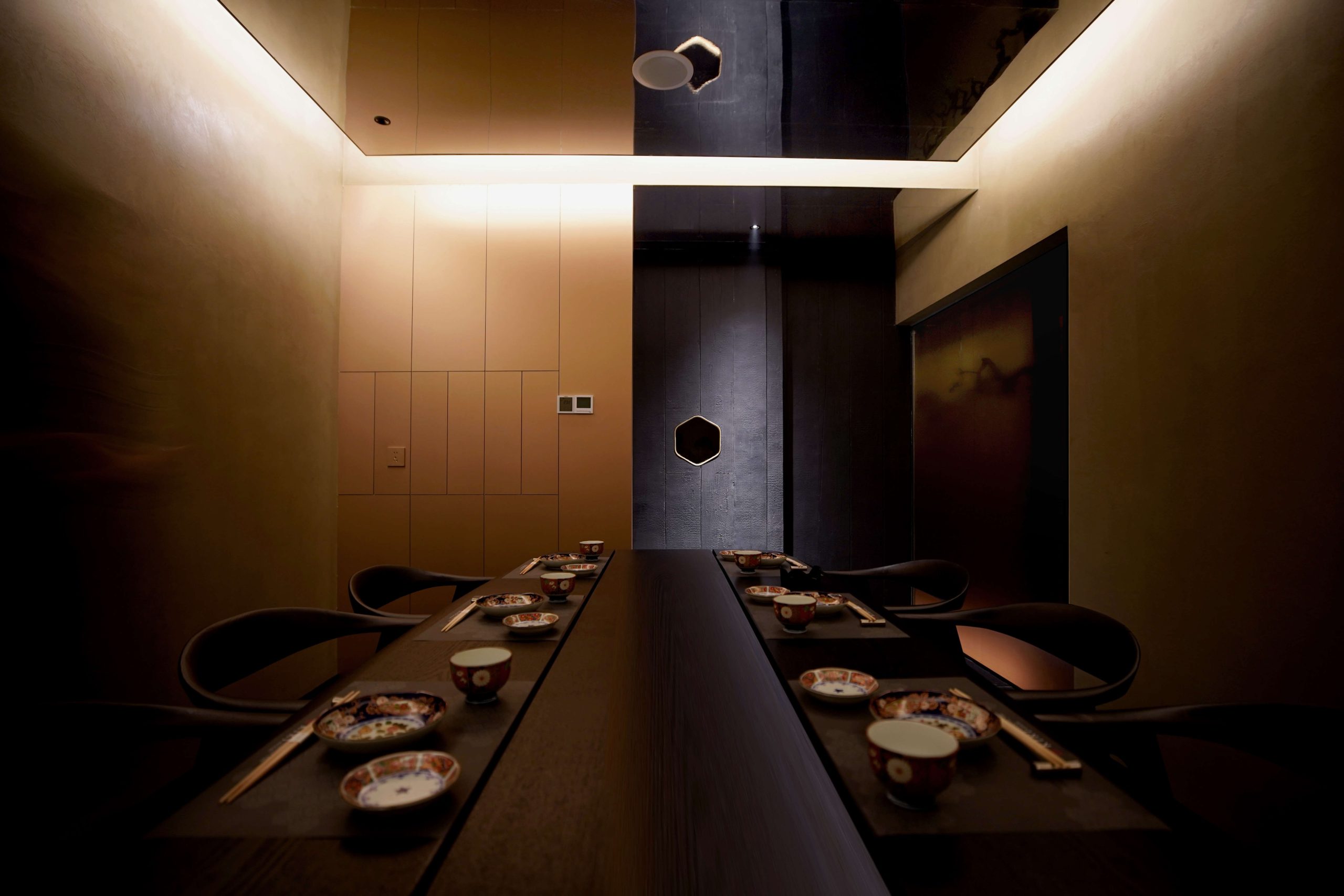
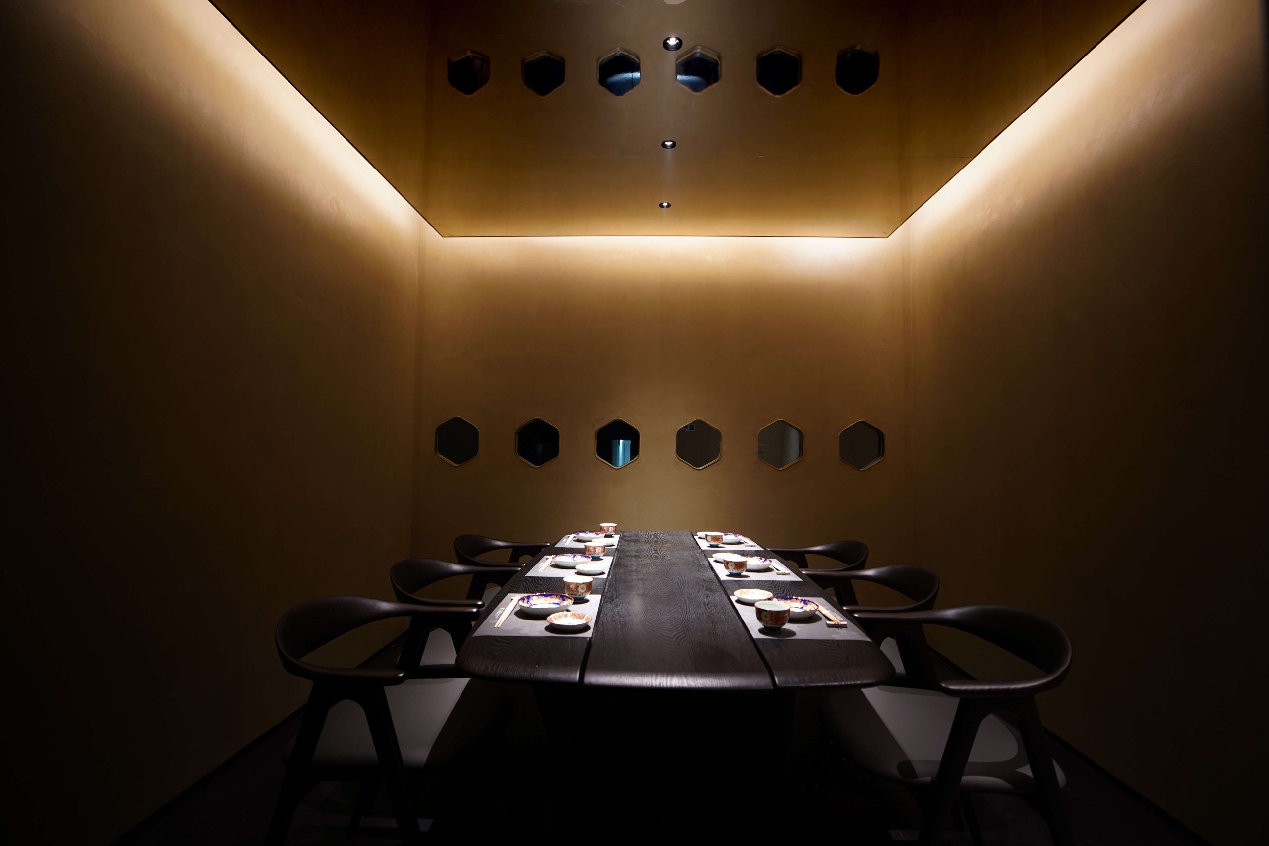
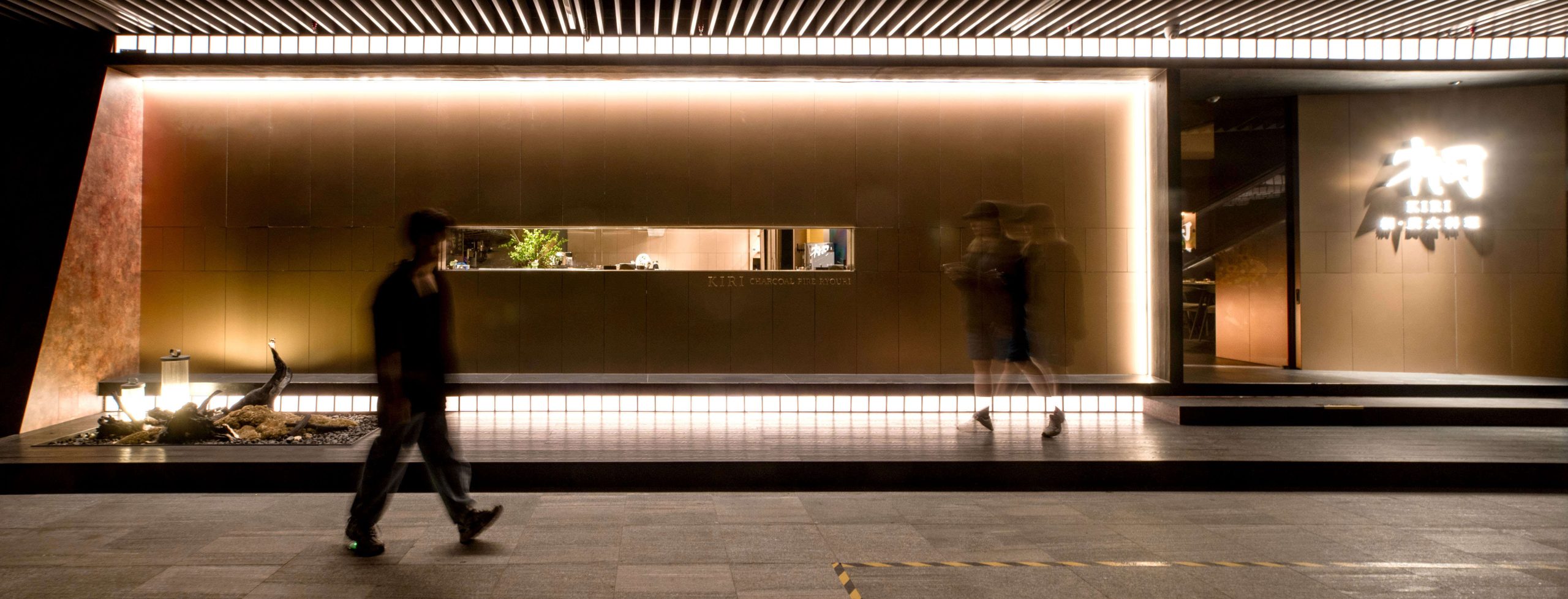
The project is a carbon fire Japanese shop; the design references the modern architecture. The logic of long axis drawing and short axis cutting makes the space interesting moving line, and the space also makes the experience of high and low level relationship. The overall structure of the project does not look through and increase the interest of voyeurism and spatial interaction.
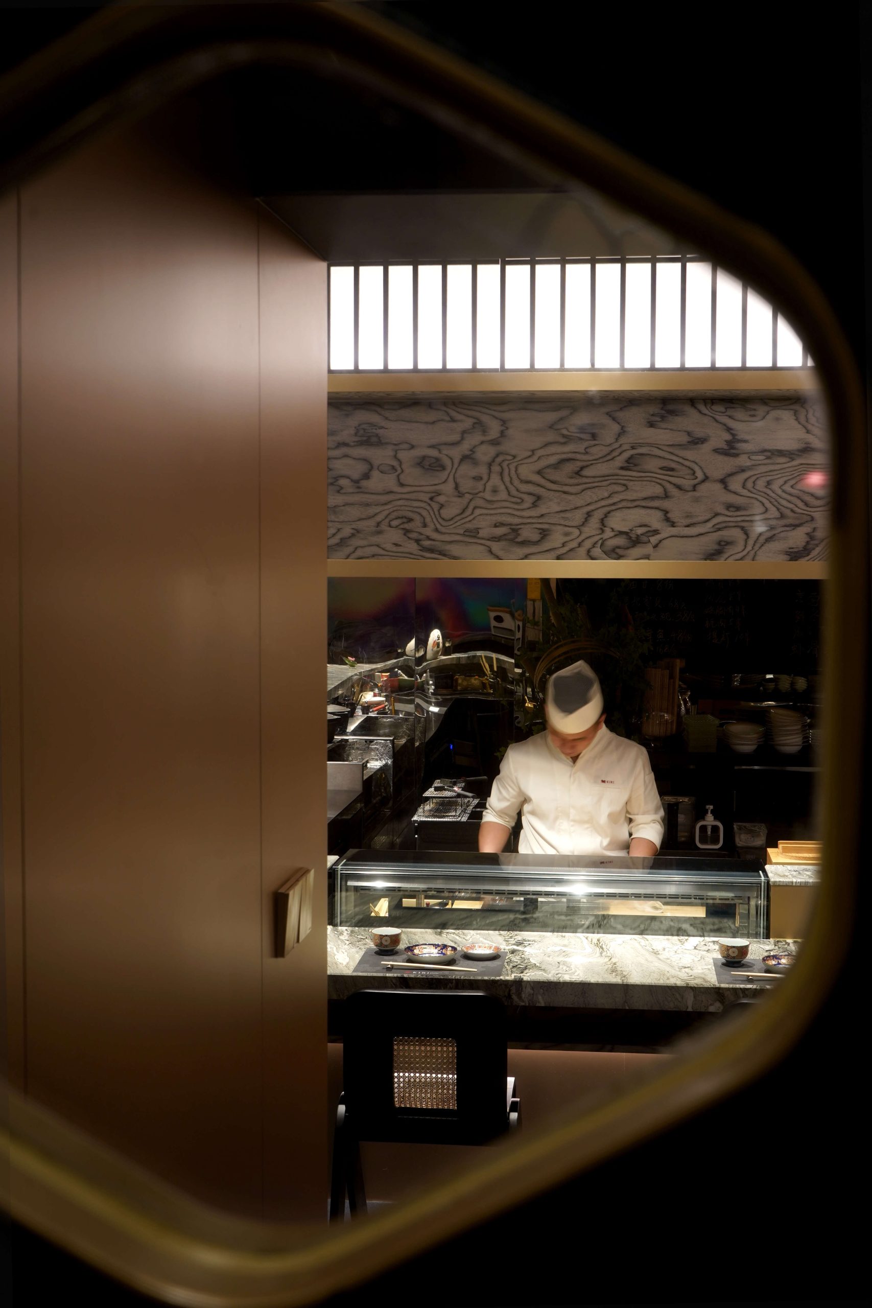
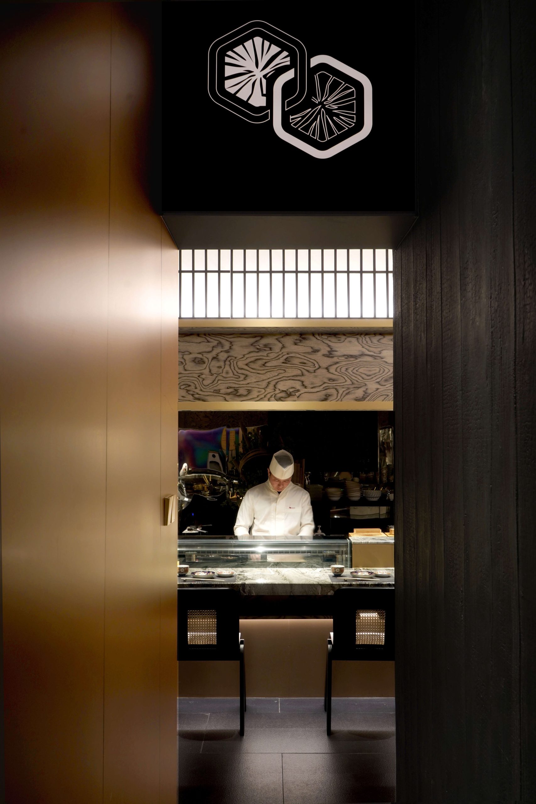
The entrances and streamlined spaces appear in a subtraction fashion to create a reception Entryway that visually creates a two-way entry path, one that cuts horizontally into the lobby and the other that enters the private compartment from the short side. The spatial design retains the visual maximization technique-the diagonal visual emphasis in the plane layout: the dislocation structure makes the compartment of the space improved and the visual interaction between the space and the space which can be separated by the contact of the eyes, such as glass; Hard-set modeling uses asymmetry, structure of the extension, stacking, balance and other techniques in the stretch of the field in a simple form + simple modeling to create a sense of rhythm of space.
Scale in the project plane, the division from the region can be found in a number of recurring basic shapes with integer scale. Like golden ratio rectangles, 1:2 rectangles, and 1:3 rectangles. The combination of diagonal and perimeter space separates visual and tactile experiences (line of sight and line of motion) , adding to the overall interest of the perceptual space.
Material and theme modeling a large number of use of light-colored imitation metal prefab, dark gray tiles, sand art paint and characteristics of wood veneer, copper-based space, the overall quiet and comfortable; Considering the flat layout of the entrance and the backlit position, the visual focus in Entryway was made visually interchangeable with the mezzanine room to highlight the theme colors through the strong saturation and contrast of the glass, it is hoped that the combination of glass properties will allow the person to move with the visual angle and light and shadow changes in this visual device with spatial penetration, mirroring and reflection of the visual extension.
Space is constant, constantly changing is the people, things, landscape.
Project area: 150 sq.
project type: Restaurant
Company: NON-DESIGN
design by:Brandon Lau, Yvonne Kwok
Design Team: Apollo Jeffery
Photographyby Zack Zhang
Founded in October as a 2021 space design start-up.
Non is an overlap of the English names of the company's two design directors (Brandon and Yvonne) : two n's and an O; NON also has unfinished, NON and no meanings, it is also the pursuit of two design directors for the work, not for the design and design for the work of the completion and pursuit is also continuing. The Chinese name of MEI and Cantonese is not homophone, the space is not only people dream space also pass the meaning of a nap.