- 2019 Silver Prize
- From Culture Office
ZOOM WAY studio
Projet Description
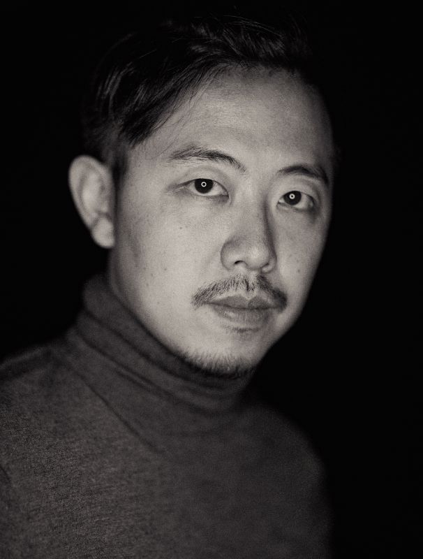
This is a photography studio which is designed for the photographer Mr. Zhou Wei. The base of the project is an industrial factory building that is located in the East Five Rings of Beijing.
Site conditions before renovation
Nearly 7 meters’ height of the space and continuous triangular roof truss are typical features of this industrial building. We hope that the space attributes of this site can be retained and utilized more or less in the renovated space in order to create a space atmosphere which can make us have a unique experience.
In terms of photographic art, our understanding is to capture the tension between the object which is photographed and the environment, or the internal tension of the object that is photographed. From the aspect of space, we also hope to express the tension and the sense of contradiction of space through the volume comparison and combination between virtual and real and some other space designs.
Entrance
谜舍刻意压低了原厂房的入口
We lowered the height of entrance of the original factory building, and placed a black steel box with a rotation of about 15 degrees as the entrance. Besides breaking the normal state of the entrance and making it face to the main stream of people, the action of rotation avoids seeing the interior space too directly through the entrance and creates a certain degree of ambiguity. The source of linear light which is hidden at the bottom of the steel box makes the box lighter visually and plays the role of guiding guests.
We divided the photography office area into two parts, and build the second floor of steel structure on the north side of the space, where the functional rooms are centralized here. We set the void space on the south side as reception area and waiting area. From a relatively closed box to a void area and then to a relatively dense functional area, we created such a different place through the change of space volume.
Studio
The most appealing works of Mr. Zhou Wei are the black-and-white photographs. We also set color black and white as the dominant tones of the whole space, and to highlight the pure artistic atmosphere of space in a concise way.
We define the void space as a small gallery, with the pure white environment as its background. The front desk, the entrance box, the door of the studio, the steel ladder and a series of large building components are processed and they are very complete and full of the sense of sculpture, which has naturally become the "art exhibits" of this "small gallery".
We designed the wall of the VIP reception room as a white grille. The open and private grille wall is connected with the background wall as a whole, which is an image with the deficiency and reality.
We set up a cement platform with the appearance of the outdoor cement platform on the front end of the stairs to the second floor, and we connected the stairs with white sand and stone which are tiled on the floor and created an area in the interior which is similar with the outdoor area in order to blur the space boundary between the interior and the exterior.
The conference room on the second floor looks like a white box inserted in the second floor. The vertical and crossed relationship of the space greatly improves the dramatic sense of the space, which not only creates the privacy of the lobby area, but also enriches the experience of the users who are in the conference room.
The conference room on the second floor looks like a white box inserted in the second floor. The vertical and crossed relationship of the space greatly improves the dramatic sense of the space, which not only creates the privacy of the lobby area, but also enriches the experience of the users who are in the conference room.
Photography is the art of light and shadow. We use a large number of linear light sources to heighten the simple atmosphere of the space. The finished light bars are put into the bottom of the white grille in order to emphasize its sense of order.
The light bars are hidden at the top and bottom of the stairs in order to heighten the sculpture volume of the stairs.
Staff Room
There are some unsightly light bars hidden in the indoor space so as to create a soft and high-class environment.
The ceiling in the corridor area uses continuous finished light bars as the only source of lighting in the space to enhance the cleanliness of the space.
The light-transmitting windows of different sizes and heights are used in the facade of the office on the second floor to enrich its texture and the corridor space of the second floor can be lighted up by indirect light.
Simple design of the stealth door and the use of visual sign system of the space can enhance the delicacy of space.

